
I wanted something to feel warm, because I like to think I am. I wanted it to express who I am.
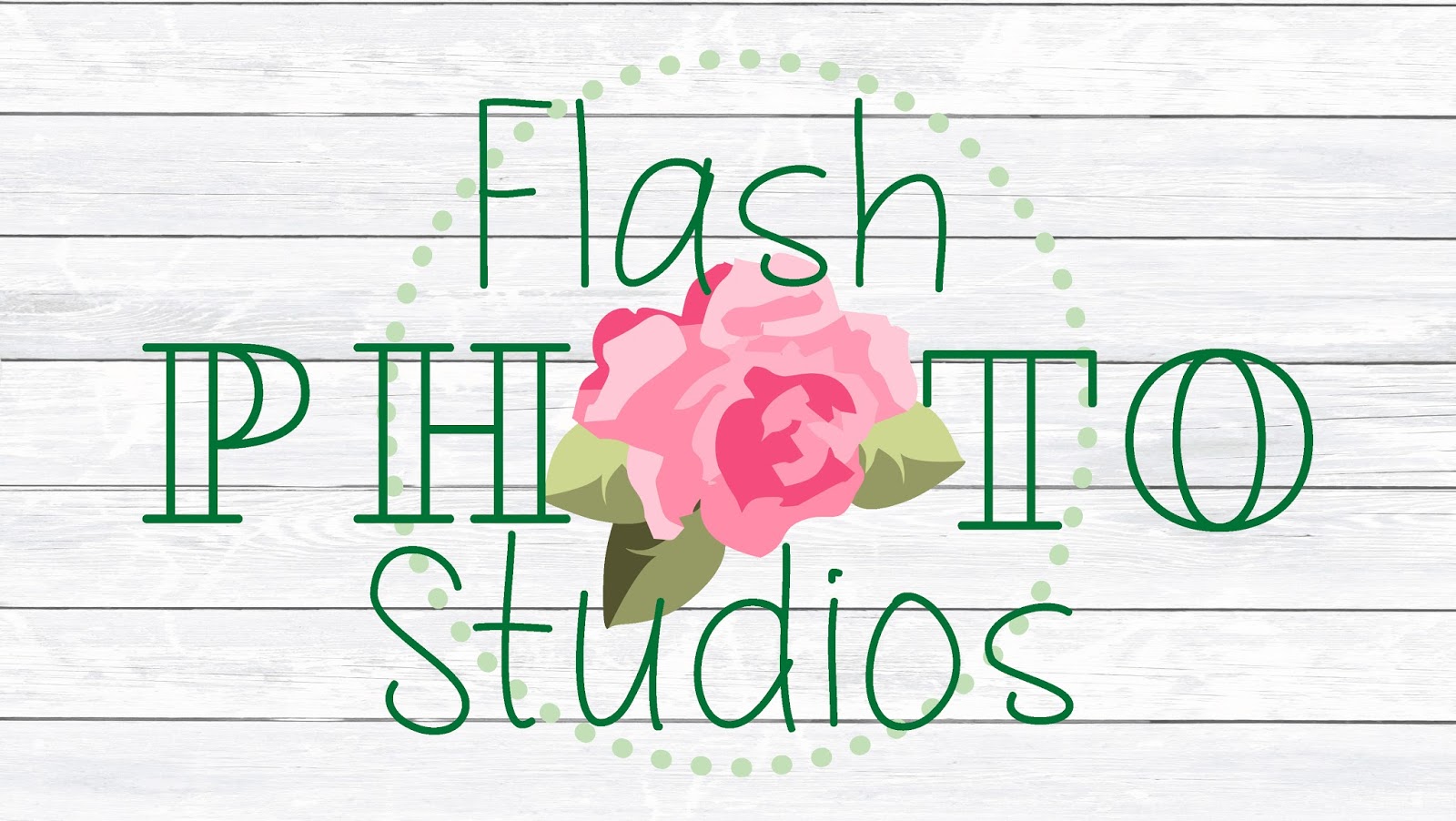
I have loved roses since I was a little girl. Not the beautiful bouquets in flower shops-- the kind still attached to the bush and growing wildly full of thorns and the amazing smell that try as people might, can't be reproduced. I prefer red to all things, but the color didn't fit with the green I had planned (Stems and leafs) So I went with different shades of pink. I love pink. I wrote my business name out on paper and began to doodle what I think I wanted it to look like.

I thought I needed something that was VERY ME. I absolutely love my business name. It seems silly, but I love it and took so much time choosing I am quite attached to it.
Flash. The first word is important not because the camera “flashes” when you take a photo, but because the moment and how it flashes by so quickly. For me raising children the days pass slow but the weeks fly by. I thought the first year of my oldest daughters life would take forever. She’s twelve. It happened so fast I swear I was present, but it just happened so fast!
Photo. …because they’re photos. Seriously, that simple.
Studios. I knew when I started this company I wanted a physical space. I love having a physical studio I can drive to every day and work with lighting and posing when the sun is to low, to high, hiding behind clouds or pouring down rain. I love having a place with all of the images that make me happy all around. One day, I hope there is more than one.
Let’s get to the logo change. I started with a “frame” I wanted bright and fun colors so I chose blue and green. This made me happy for a few years, but I felt like I needed something more ME.
My first thought was using the “O” is photo and making it a camera flash. That didn’t work out. It just didn’t look right. I wanted the font to be something I could relate to as well. Can you relate to a font? Well, I wanted too. I started doodling with letters, and photos. I LOVE roses. (We’ll get to that in a later post)
I chose the flower bloomed and beautiful full of life and bright colors. I chose a font that looked as close to my handwriting as possible. I felt that was the closest way to get personal with something so simple. I hope you all like it!

No comments:
Post a Comment